

Te Whangai Trust
UX/UI . WEB/MOBILE . GRAPHIC
Overview
CLIENT
Te Whangai Trust
The Te Whangai Trust website was outdated and overwhelming It misrepresented the organisation’s purpose, which is to uplift and upskill those struggling to find employment, through a variety of social, environmental, economic, and cultural projects.
Initially, as a team of four we we were asked to redesign the website. This extended to developing the website, which I completed independently. The goal was to produce a website that would highlight the organisation and their values.


UNPACKING THE BRAND
We drilled into the logo, which used a koru. We continued using the koru as the central element, because like the organisation, it encourages “new life, growth, strength and peace”.
As the project extended to an individual assignment, I explored the brand further and began to understand that the organisation’s values are based on four pillars - social, environmental, economic, and cultural. The logo was divided to represent each pillar, working together to ensure growth.


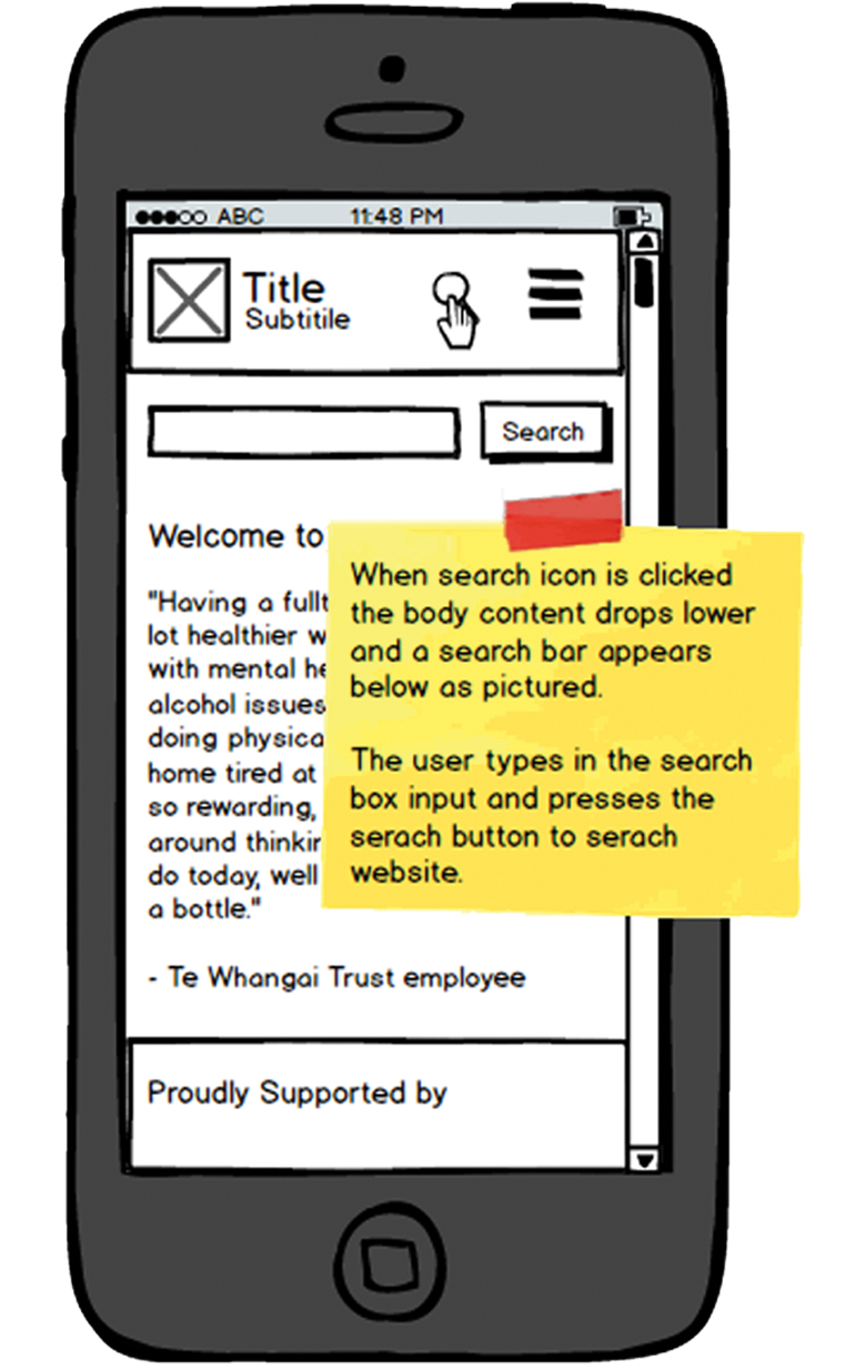
WIREFRAMES FOR MOBILE
I explored the layout and functionality for mobile, including the restrictions that the small screen size presents.

PEOPLE FOCUSED
In collaboration with the client, I worked to identify and understand the audience and their relationship with the organisation. The content was refined to be more relatable and friendly.
